I have a space on either side of my page,
that I need to follow the viewport when scrolling down
Chrome, on windows, seems to have a text rendering bug
that is especially bad when it comes to
red text on dark backgrounds.
This page has two types of red text
- <span> with position: relative;
<code>
When this center page is fully visible vertically, they both look fine
But, if you resize the browser window so that isn't tall enough to fit this page
this red text will be fine, but- this red text will go thin
- even if we make it monospace
additionally
My actual use case is rendering math using
katex, both inline
a
and like this:
ab=ebln(a)
Here's a
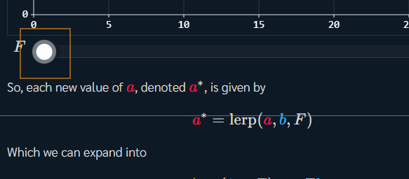
.gif of a custom slider breaking nearby math on my website, with chrome's debug render layer view enabled
In CSS:
- Disabling
.space{ position: sticky; } or
.space{ top: 0px; } or
.red{ position: relative; }
- prevents the window-size bug from happening
- but not the input field issue
*{ box-sizing: content-box; }
.page{ transform: translate(0px, 0px); }
- makes
this style will behave the same as this style
.page{ transform: translate(0.4px, 0); }
- has the same effect as above, but, notably, subpixel css translations does
not break text rendering
as long as the page is fully visible
.page{ transform: translate3d(0px, 0px, 0px); }
- breaks both
this and this,
regardless of all other css settings/window size
None of the following makes any difference:
*{ text-rendering: ... ; }*{ -webkit-font-smoothing: ... ; }*{ -webkit-backface-visibility: ... ; }
Chromium issue tracker
The line below is the bottom of the page
writeup by @FreyaHolmér
These spaces need to be in a flex with the main page in the middle,
which prevents me from using things like position: fixed;